Animation style, acceleration, deceleration and motion are all very important things to consider when designing a user interface. Luckily most of these can be implemented using CSS transitions.
One of the easiest ways I’ve found to edit own transition and animation styles outside of the few keywords that have good browser support such as linear, ease-in, ease-out and ease-in-out is using Chrome DevTools cubic-bezier designer.
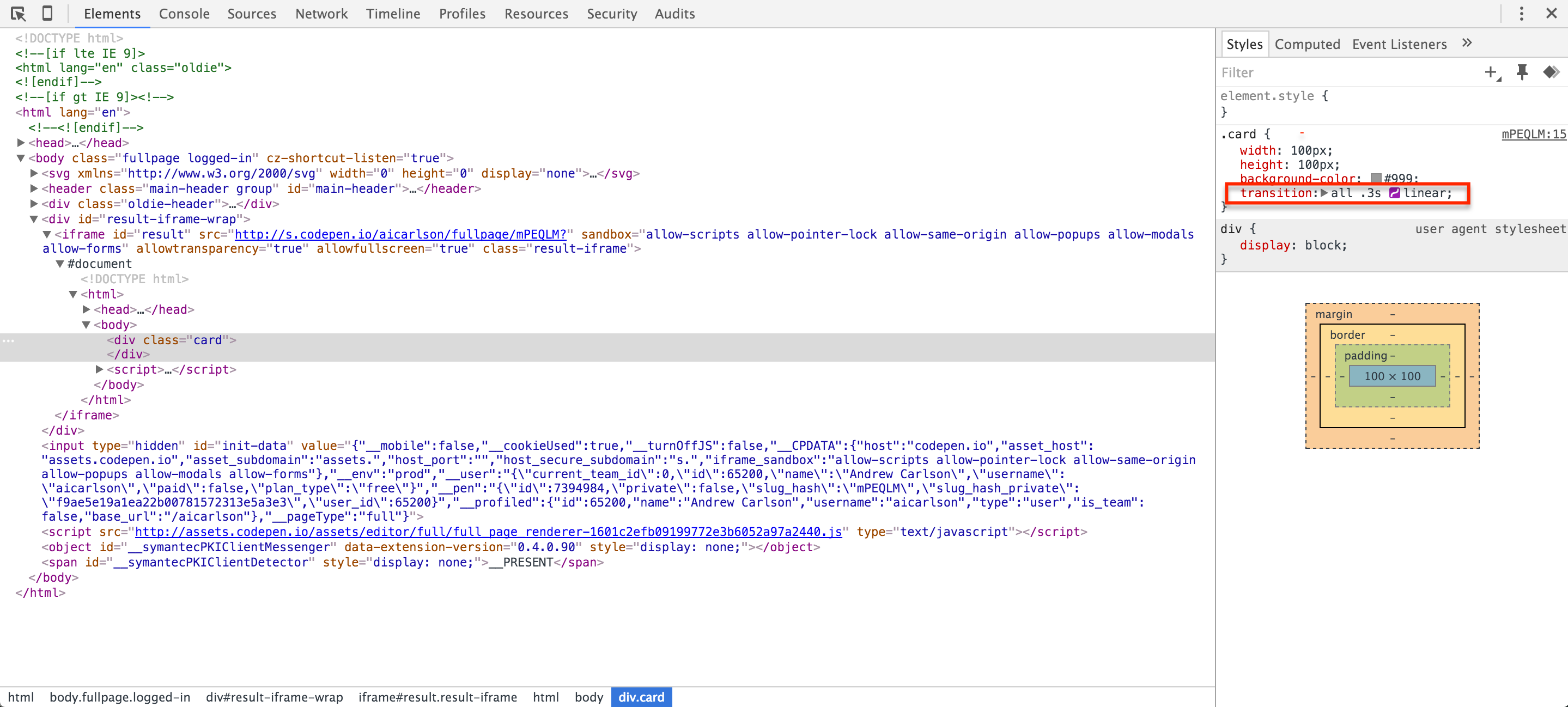
If we inspect an element in Chrome and apply a transition to an element we should see a small icon next to the type of transition.

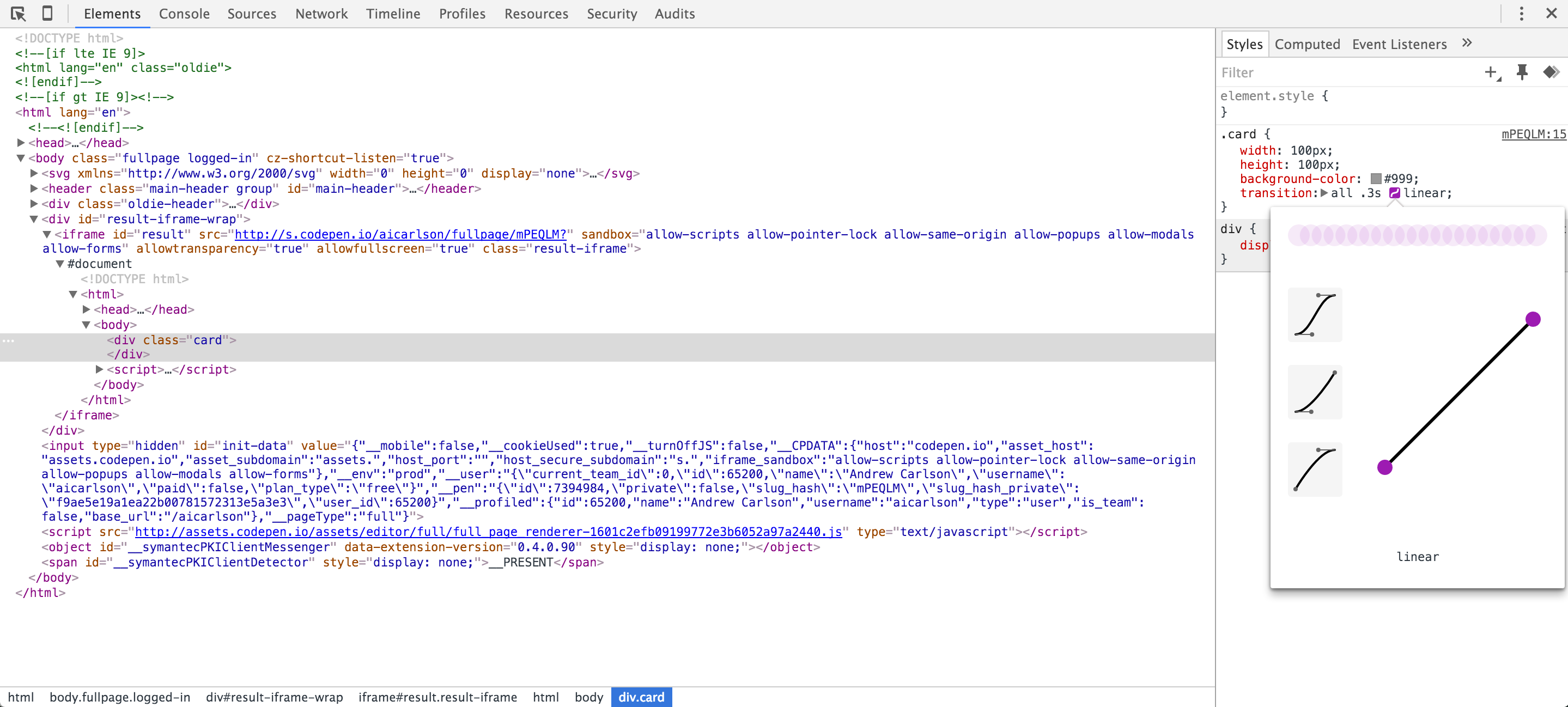
If we click on the icon it will open an editor showing the current transition style.

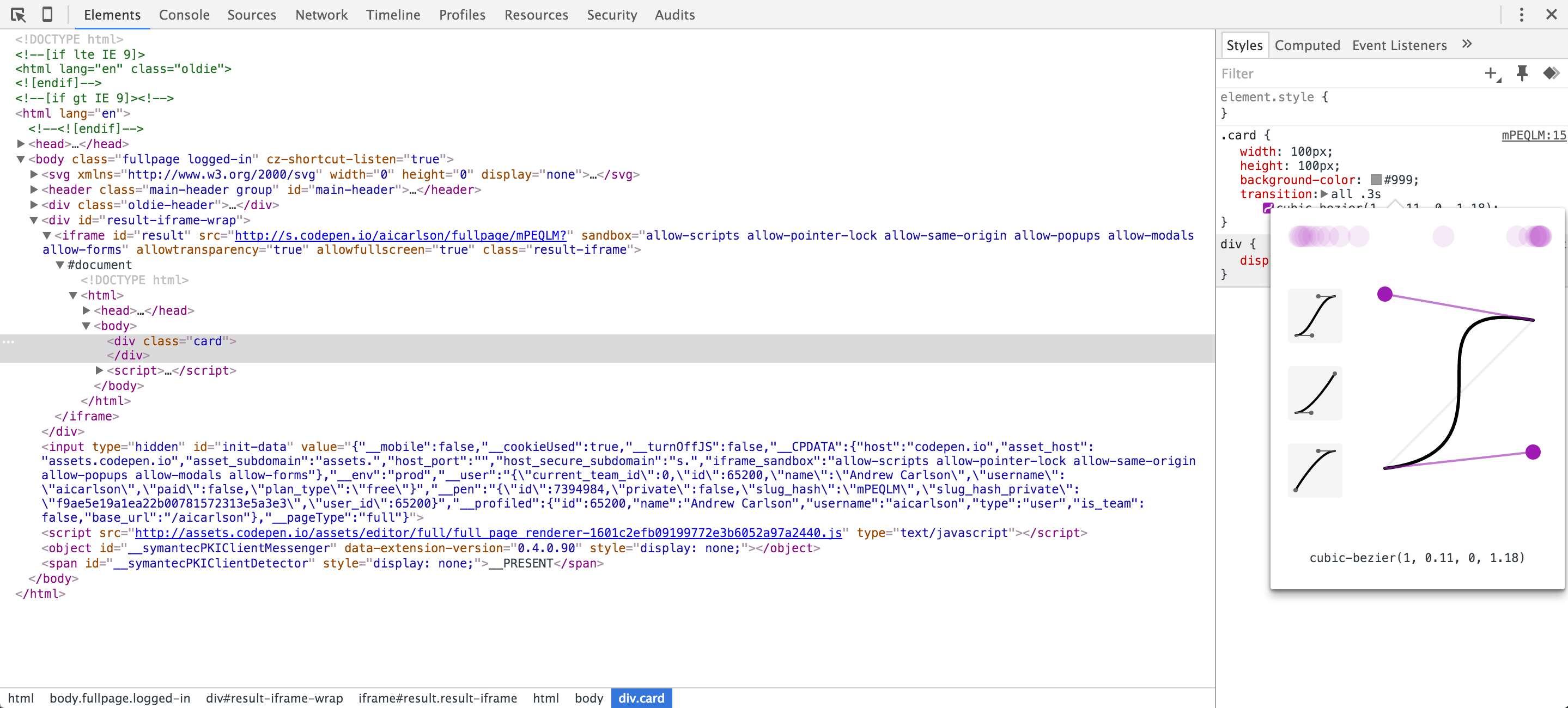
From here we can select the handles on the line and adjust them and watch an example of the transition before it is applied. This value can then be copied out into our CSS!

If you’d like to learn more about motion and animation in UX design, check out Google’s Material Design Guidelines on motion.